Sunday, March 19, 2006

The Waiting Game


We just got back from a trip to Cochabamba, Bolivia, and I was often thankful for the ability to look at things with the eye of a painter. Not just in noticing the beauty of new surroundings, but also as something to do while waiting. When you travel, you spend a lot of time waiting ~ in airports, in restaurants, in shops, in friends' houses, or standing in line. Waiting for transportation, for people, waiting to be waited on. It's a lot more fun if you switch into Guerrilla Painter mode and start composing a painting. In a cityscape, which is where we were most of the time, this becomes an exercise in abstract patterns of color, shape & value. I noticed how black can actually have a cheerful face. A big piece of luggage shaped like a drawstring bag or a door with fancy relief decoration (accented with white dust) can make you smile. On the other hand, who would have thought that blue -true blue- might look ominous, intimidating? If it's a tall, narrow wooden door with angular panels & rigid lines, it can give you pause.

This kind of awareness might actually become easier if there's a language barrier between you & the people around you. Shift into the "common language" of art.

Thursday, February 23, 2006

Local color


Watercolorist Pam Furumo is another artist who's not afraid to "push" hues to a higher intensity.

Much as I've thought about it, I still wonder how they "see" those colors. One suggestion that might be helpful is, "Squint for value, OPEN WIDE for color."

And if you're using watercolor, you really need to make it *brighter* than you think, because the color fades a bit as it dries. This is where straight-from-the-tube watercolor paint really helps.

One trick that makes color seem bright, while still keeping a reasonable semblance of reality, is to contrast areas of neutral tans or grays with a small area that sings more loudly.

Juxtaposition of complementary colors is another good technique for jacking up the drama of a passage that you want to emphasize.

Sometimes a partially-mixed combination of related colors can convey a more vibrant effect than a perfectly-mixed hue.

This quality of moody light & color is where plein-air painting really comes into its own. When you are "on-the-spot," you notice depth, contrast, shimmer, reflection and intensity that just isn't there in a photo or even in your imagination.

Monday, February 06, 2006

Realism, Part Two (What's real?)

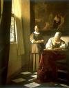
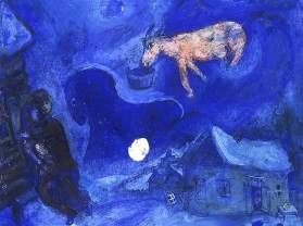
In contrast to Vermeer (previous post), Charles Camoin was a charter member of the Fauves, who believed in expressive color. This is his view of Le Pont des Arts (1904). Another, contemporary, example of a free-spirited colorist would be Natalie Goldberg. She says that color is like a metaphor, to get your attention and describe the feeling connected to what you're seeing. When she did a painting of a friend's adobe house, she chose an expressive shade of deep blue-violet. "It was as though that blue paint were a sword slashing through illusion, bringing me into direct contact with the house's essence." She paints from life, but uses the colors in her mind's eye. This process reminds me of the new breed of economists who are looking at the big picture to calculate a more comprehensive "bottom line." They take more factors into consideration. Is this operation sustainable, is it fair to workers, what are the environmental impacts? All this is part of the balance sheet. A larger, more complete, multi-dimensional picture. Our whole experience on site is part of the "bottom line" of the painting.

Thursday, January 12, 2006

Photographic accuracy

Using a digi-cam and photoshop, anyone can create a "painting" (or a "pastel," or a "pencil drawing") and print it out. There are also businesses who will do it for you, either on paper or artist's canvas, to create a paint-by-number kit of any chosen photo. This is nothing new, really. The "camera obscura" (literally "dark room," a primitive sort of overhead projector) has been used since the Renaissance to help artists render correct perspective & proportion. Leonardo da Vinci and Vermeer, among others, might have used one. Many painters today, too, produce works that, viewed from a distance, look photographic. It is impressive to see an acurate rendering. We're tempted to assign importance to what "looks real," to see it as fact, to call it genuine & true as opposed to something fanciful and imaginary. If it looks real, it must be serious, substantial & consequential. But maybe our visual perspective isn't the last word. Maybe the invisible plays a part, a crucial part, in things. Maybe movement, time, breath, energy, feelings, sounds...things you can't really see, are important, too. Maybe certain colors, lines, rhythms, shapes, darks & lights, can be meaningful, even if they're not literally representative.

Thursday, December 22, 2005

What a concept

If you google "creativity coaching" you'll bring up more than 210,000 pages. "Coaching" is a concept that originated in the corporate world of human resources, team building & leadership, and has developed a wider application in the realms of personal growth, job transition or new venture startup, & creativity. Of course, many artists hum along very well on their own, finding their muse and their audience, never missing a beat. But there are critical phases (new beginnings, transitions, inquiry) where a coach can help things along more effectively than a new class, a gallery, a cohort or counselor. A coach's only agenda is your progress, your discoveries, your decisions, your goals and your clear sailing towards them. They home in on your most heartfelt ambition and say things like, "Let's take a closer look at this thought that's stopping you," or, "What if we did some laser surgery on these obstacles in your way?" or "What would it look like if you were to think really, really big?" and "How can we manage the anxiety this will cause?" They challenge you, provide tech support & feedback, and leave you completely in charge. I think coaching is well-suited to artists and other creative people because there's never an "off the shelf" solution, and each session is tailor-made to your own circumstances. 

Saturday, December 03, 2005

Friendly Chaos

This notion is a direct affront to the German & Swiss DNA that I have, but it's true that chaos is always there, lurking just beneath the surface, so we might as well make friends with it. When you think about it, isn't chaos the wellspring for all our bold, mysteriously beautiful creations? Granted, a finished painting is usually considered to be the antithesis of chaos. Composition, color scheme, perspective, proportion, you know the drill. Trouble is, after you've worked hard to get all of those things right, you might have a spiritless painting. Very pat. The kind of painting where you look at it once and say, "Wow, that's really good," and walk away, dismissing it from your mind & memory. Watercolor has a special affinity for chaos. It tempts you to improvise. Pick up a wild card, give a nod to the personal, unverifiable and unpredictable. Designate a "Chaos Appreciation Day" (or two, or more).

Wednesday, November 16, 2005

Planet Vibes

Last Sunday we watched Can Animals Predict Disaster? on PBS. When the tsunami hit Thailand & Sri Lanka last December, the only animals who died in the huge wave were the ones who were caged or chained. All the wildlife, including nocturnal bats, fled to higher ground, and chained elephants broke free. One man's life was saved when his dogs refused to go for their usual run on the beach that morning. This phenomenon can be explained partly by the acute hearing that many animals are blessed with, and partly by the fact that many can sense "infrasound," low-frequency sound waves that can travel vast distances through water, earth or air. It's well known that elephants in Africa will "freeze" with their trunks touching the ground, "listening". Their feet & trunks are sensitive to vibrations, and their awareness can extend to events up to 25 miles away. Predators like lions also have many nerve endings in their feet (Hmmm...maybe reflexologists know something about this.) What does this have to do with painting outdoors? Like the elephants, we pay attention. We spend time in the open air observing the light, the weather, the critters and colors, and how they interact. The most important part of any painting is the quality and scope of our awareness, and the way we create meaning out of it. When we go painting, our life isn't on the line, but it might feel like it sometimes!