Friday, November 24, 2006

Imagination

I've been doing some studio paintings lately. It's fun to create our own world, free from the laws of gravity & proportion, to make the invisible visible. It's possible to do this even when you're sitting outside painting what's in front of you, but it doesn't come that easily for me. It's like thinking in two different languages...you have to make an effort to go from one mode to the other back again. 
I know it's true that painting from life will strengthen our studio work, and I suspect that the reverse is also the case. "What if the sky were coral-colored? What if that tree were in the foreground? Shall I add some contrasting texture here? There might be a storm blowing in..." 
It certainly enhances our awareness of all the things we notice around us, and it's *fun*

Tuesday, October 17, 2006

Freedom

When I visited a friend recently, I found her upset because she'd just discovered a garter snake caught on a "sticky-trap" that she'd put out for mice on her patio. It was really caught, she couldn't get it off, and it looked like the skin under the snake's chin might tear if she kept trying. We took the poor thing to the Humane Society, which has a specialist in wildlife rescue. He removed the trap with cooking oil (good to know) and we brought the snake back with us. Snakes do eat mice, after all. This whole time, I was wondering if the snake was injured, because it wasn't moving very much, even though only its head & a few inches were caught on the trap. She set it down on the patio, and I was amazed to see it come to life - zzzzzzzzzip - it took off. It was suddenly powerful & graceful. I wonder if the reason our sketching & painting isn't always powerful & graceful is due to our being caught on something... expectation (our own or someone else's), conventional ideas, time constraints, fear, left-brain thinking, the inner critic...(fill in the blank). In one of Jeanne Carbonetti's books, she says, "There's no way you can fail." if you're responding to the painting as it is evolving. There's no need to be fast, just be free.

Monday, September 18, 2006

Jim Messina

I was reading an interview with Jim Messina the other day and found out that he’s one of many celebs who enjoy painting (others being Joni Mitchell, Paul McCartney, Jane Seymour, Donna Summer, Tony Bennett, Jennifer Aniston, Michelle Pfeiffer...) He said that it helped him look at his music differently when it came time to mix it in the studio (hmmm...it even *sounds* like the same process). 
He said, “A hot color might be something with a lot of high end on it, and a cool color might be ‘bassier,’ so to speak. Learning the perspective and how to create the illusion that something is further away from something, while another item is further away than that, and there has to be an object in there that gives you that reading where your eye sees it and sees the illusion – and the same is true with music. There has to be something in there that tells you that’s ‘distance’ and this is ‘up front.’" 
I've always known that painting lets you see things differently, and I guess it lets you hear things differently as well!

Sunday, September 03, 2006

Art

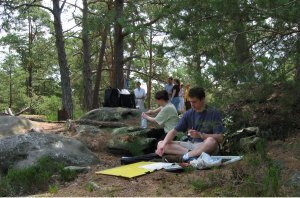
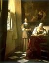
One of the things I love the most about the guerrilla painter is how profound his off-the-cuff replies sometimes are. Last week I mentioned to him a story I’d heard on NPR about how Jan Brueghel collaborated with Rubens, one painting the landscape and the other the figures. It seems the art market in 16th century Belgium was so lively that artists arranged themselves into assembly lines, each contributing what he did best. Carl’s comment was, “Back then, art wasn’t Art.”

That got me thinking, “Who defines what 'Art' is, anyway?"
Is it the establishment? Whatever is seen in the context of museums, galleries, schools and publishers?
Is it the investors, the collectors, the critics?
Is it the person who views the work?
Is it the artist him/herself?
Is Art anything that’s done for the sake of pure expression rather than for commercial or practical purposes?

We have more artists today that ever before, as well as more techniques & materials, not to mention more history to refer to.

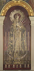
Art mirrors so many different values: innovation, emotion, skill, color, human form, religious truths, patriotism, irony...

Maybe trying to define it is just a trap, something that gets in the way of creating, appreciating, communicating, practicing & playing.

Friday, August 11, 2006

Back to the drawing board

Betty Edwards uses drawing not just to sketch or create works of art but also as a mode of thinking. It accesses the "right side of the brain," where things are not bound by logic, facts, past experiences or words.

She compares it to learning to read & write... you may be able to speak fluently, but if you don't read or write, your thinking is comparatively limited. Most people can see quite well, but if they don't draw, there's a lot they don't notice. Drawing on a regular basis can expand your awareness.

Sad to think that in some places art classes are being removed from schools. Perception, proportion, relationship, patterns, construction, point of view, "negative space" (the space around the problem...context) & wholeness are useful concepts to think with.

Monday, July 24, 2006

Country mouse

There's an organization of French plein-air painters called Les Rats des Champs, which, loosely translated, means "Field Mice." What a great name. And some of them are coming to Colorado this month. 
 I was just thinking about how playfulness is a cornerstone of creativity (if creativity *has* cornerstones). Sometimes it helps if you don't take things too seriously. Experimentation, imagination, letting go of expectation, these are the things that will put you in the zone and make painting easier. It doesn't have anything to do with a certain style. You can do illustration, traditional Chinese painting, tonalism, whatever, and still add a light-hearted touch. 
 When we were in Lima, Peru, we went to the movies. We saw "Fun With Dick & Jane" and also the trailer for "Valiant," the animated pigeon movie, and I said to the Guerrilla Painter, "You know, if anything is going to redeem the United States these days in the eyes of the world, it's this. THIS makes me proud to be from the U.S."

Saturday, July 22, 2006

Darkness & Light


Regardless of its other advantages or disadvantages, watercolor canvas definitely makes it easy to play around with value. You can use thick, dark paint without fear. You can make it lighter, if you need to, and lighter still until it's almost gone. Recently I was using a sandstone-red alongside a sagebrush-green, and when they blended they made a particularly nasty-looking dark grey-green. No problemo! I lightened it, then I lightened it some more, and a little more. It actually turned into a very nice tan. "How Buddhist," I thought. "All anything really needs is a little more light."

And then there's the "problem" (why are aesthetic questions always "problems"?) of balancing darkness & light in your composition... if you're using watercolor on canvas, you can go back & "fix" things forever as long as you haven't varnished it.

Thursday, June 08, 2006

Watercolor Canvas

Watercolor canvas is the new kid on the block, and we're looking it over. It requires different techniques from the way you paint on paper, and there are e-books and DVDs arriving to tell about it. The advantage is that you can make changes, lifting or wiping away areas with a brush, paper towel or sponge. It's not as absorbent as paper, so it's important to let each layer dry before painting over it. Even then, the paint will lift unless you to a quick once-over-lightly for the second coat. Some people prefer to add gouache to get better coverage, or to add acrylic gel medium for the top layers (this would of course be permanent). The canvas texture seems a bit coarse for portrait painting, as the color sinks into the weave. On the plus side, it's fun to have the grid of the canvas to guide vertical or horizontal lines, and the texture acts almost like pixels, so you can add tiny dots to make subtle changes of color or value. It's also fun to be able to push the paint around until it looks right. The real key is using *fresh* paint, and don't be afraid to make it bright or very dark, since it's easy to lift it out. A final coat (or two) of acrylic varnish makes a durable, permanent surface that can then be framed without glass.

Sunday, April 30, 2006

The Immortal Sargent

Does this make you think of John Singer Sargent? Me neither. 
We were in Boston recently, and we were surprised to see the Sargent murals. I didn't know he'd done any murals, but there were many of them. They were commissioned by the Boston Public Library and Museum of Fine Arts in the last two decades of his life. Of course, he was renowned for his portraits, landscapes and figurative works in an impressionist style, but he wasn't satisfied with that. He was glad to have the opportunity to do murals, because he wanted to be remembered for more "serious" subjects. He chose biblical scenes for the murals. I guess we never can tell what we'll be remembered for.

Sunday, March 19, 2006

The Waiting Game


We just got back from a trip to Cochabamba, Bolivia, and I was often thankful for the ability to look at things with the eye of a painter. Not just in noticing the beauty of new surroundings, but also as something to do while waiting. When you travel, you spend a lot of time waiting ~ in airports, in restaurants, in shops, in friends' houses, or standing in line. Waiting for transportation, for people, waiting to be waited on. It's a lot more fun if you switch into Guerrilla Painter mode and start composing a painting. In a cityscape, which is where we were most of the time, this becomes an exercise in abstract patterns of color, shape & value. I noticed how black can actually have a cheerful face. A big piece of luggage shaped like a drawstring bag or a door with fancy relief decoration (accented with white dust) can make you smile. On the other hand, who would have thought that blue -true blue- might look ominous, intimidating? If it's a tall, narrow wooden door with angular panels & rigid lines, it can give you pause.

This kind of awareness might actually become easier if there's a language barrier between you & the people around you. Shift into the "common language" of art.

Thursday, February 23, 2006

Local color


Pam Furumo is another colorist who's not afraid to "push" hues to a higher intensity.

Much as I've thought about it, I still wonder how they "see" those colors. One suggestion that might be helpful is, "Squint for value, OPEN WIDE for color."

And if you're using watercolor, you really need to make it *brighter* than you think, because the color fades a bit as it dries. This is where straight-from-the-tube watercolor paint really helps.

One trick that makes color seem bright, while still keeping a reasonable semblance of reality, is to contrast areas of neutral tans or grays with a small area that sings more loudly.

Juxtaposition of complementary colors is another good technique for jacking up the drama of a passage that you want to emphasize.

Sometimes a partially-mixed combination of related colors can convey a more vibrant effect than a perfectly-mixed hue.

This quality of moody light & color is where plein-air painting really comes into its own. When you are "on-the-spot," you notice depth, contrast, shimmer, reflection and intensity that just isn't there in a photo or even in your imagination.

Monday, February 06, 2006

Realism, Part Two (What's real?)

In contrast to Vermeer (previous post), Charles Camoin was a charter member of the Fauves, who believed in expressive color. This is his view of Le Pont des Arts (1904). Another, contemporary, example of a free-spirited colorist would be Natalie Goldberg. She says that color is like a metaphor, to get your attention and describe the feeling connected to what you're seeing. When she did a painting of a friend's adobe house, she chose an expressive shade of deep blue-violet. "It was as though that blue paint were a sword slashing through illusion, bringing me into direct contact with the house's essence." She paints from life, but uses the colors in her mind's eye. This process reminds me of the new breed of economists who are looking at the big picture to calculate a more comprehensive "bottom line." They take more factors into consideration. Is this operation sustainable, is it fair to workers, what are the environmental impacts? All this is part of the balance sheet. A larger, more complete, multi-dimensional picture. Our whole experience on site is part of the "bottom line" of the painting.

Thursday, January 12, 2006

Photographic accuracy

Using a digi-cam and photoshop, anyone can create a "painting" (or a "pastel," or a "pencil drawing") and print it out. There are also businesses who will do it for you, either on paper or artist's canvas, to create a paint-by-number kit of any chosen photo. This is nothing new, really. The "camera obscura" (literally "dark room," a primitive sort of overhead projector) has been used since the Renaissance to help artists render correct perspective & proportion. Leonardo da Vinci and Vermeer, among others, might have used one. Many painters today, too, produce works that, viewed from a distance, look photographic. It is impressive to see an acurate rendering. We're tempted to assign importance to what "looks real," to see it as fact, to call it genuine & true as opposed to something fanciful and imaginary. If it looks real, it must be serious, substantial & consequential. But maybe our visual perspective isn't the last word. Maybe the invisible plays a part, a crucial part, in things. Maybe movement, time, breath, energy, feelings, sounds...things you can't really see, are important, too. Maybe certain colors, lines, rhythms, shapes, darks & lights, can be meaningful, stirring, even if they're not literally representative.